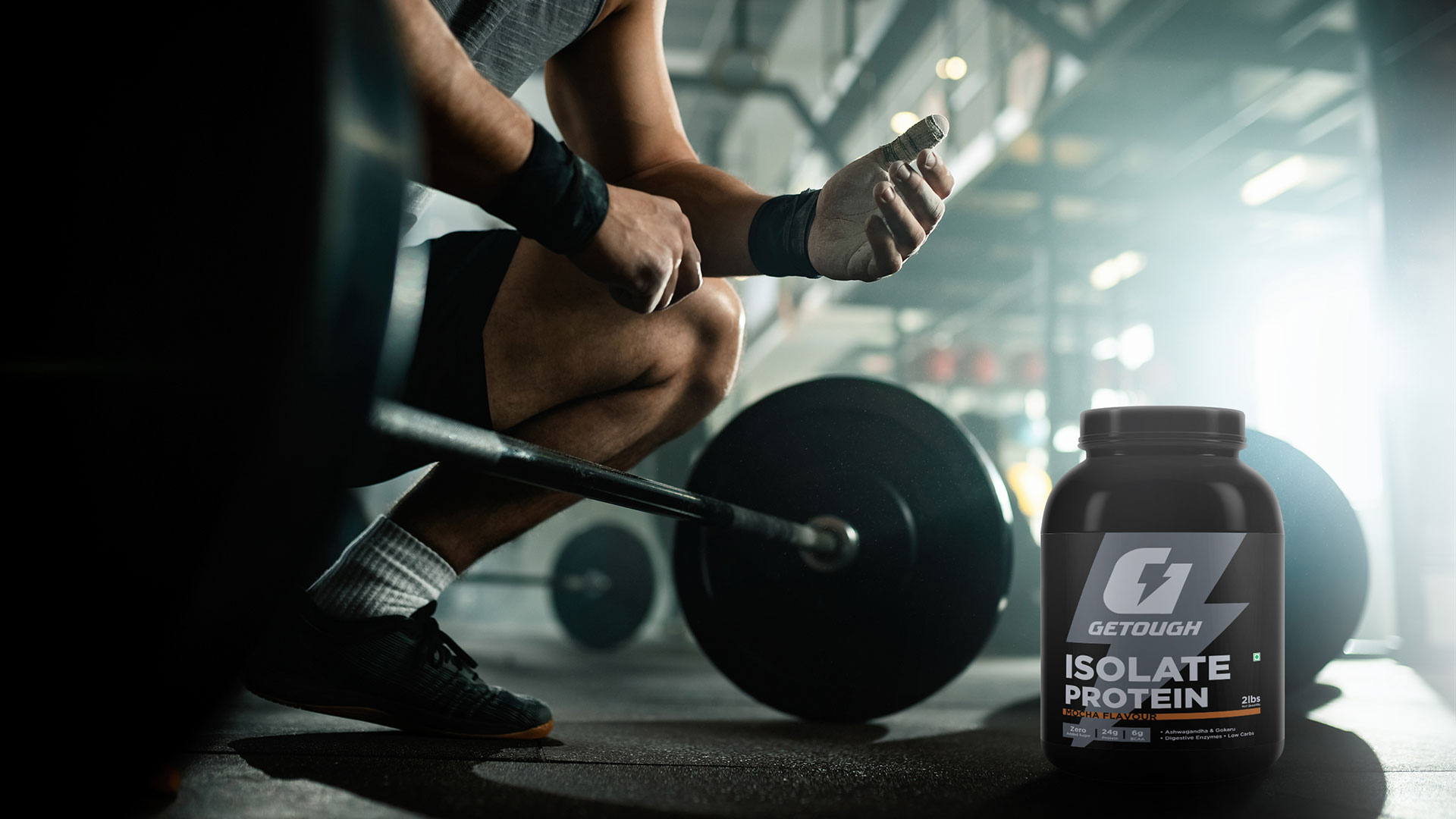
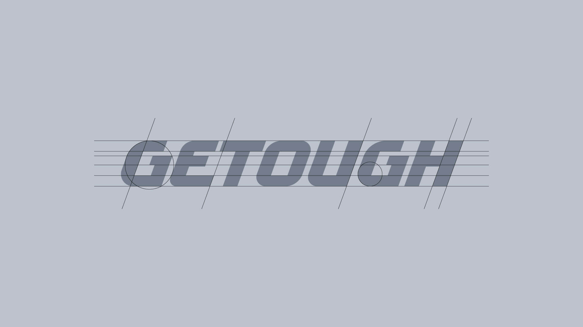
The brand name GETOUGH is an amalgamation of the words ‘get tough’ that inspires youths to ‘get up’ and reflects the brand's mission to empower individuals to be bold enough to overcome challenges and push their limits. An identity that captures a sense of strength, determination and resilience for fitness freaks.
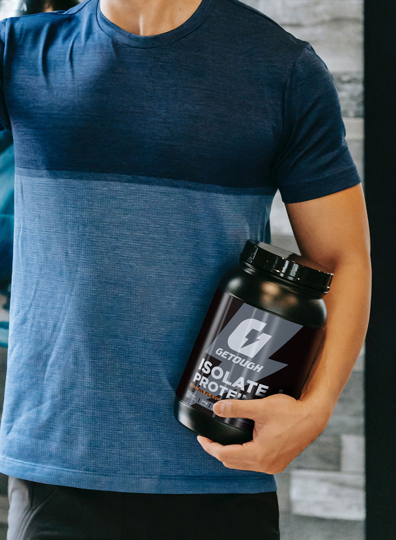
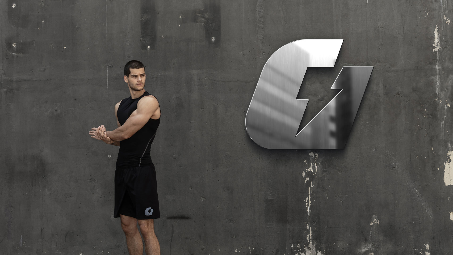
Getough is a newly established brand that helps professional athletes and gym enthusiasts achieve their goals with sports nutrition products.
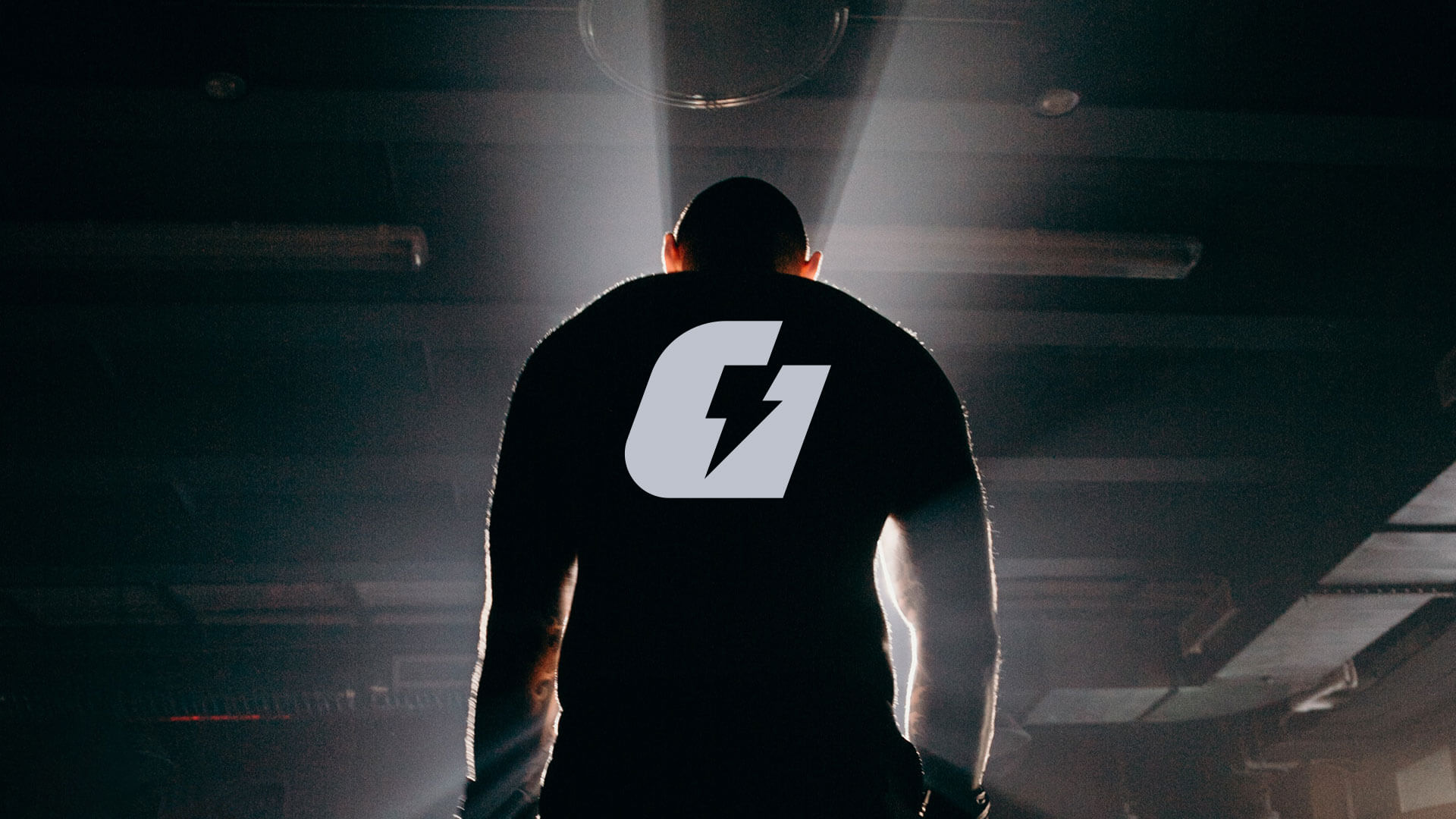
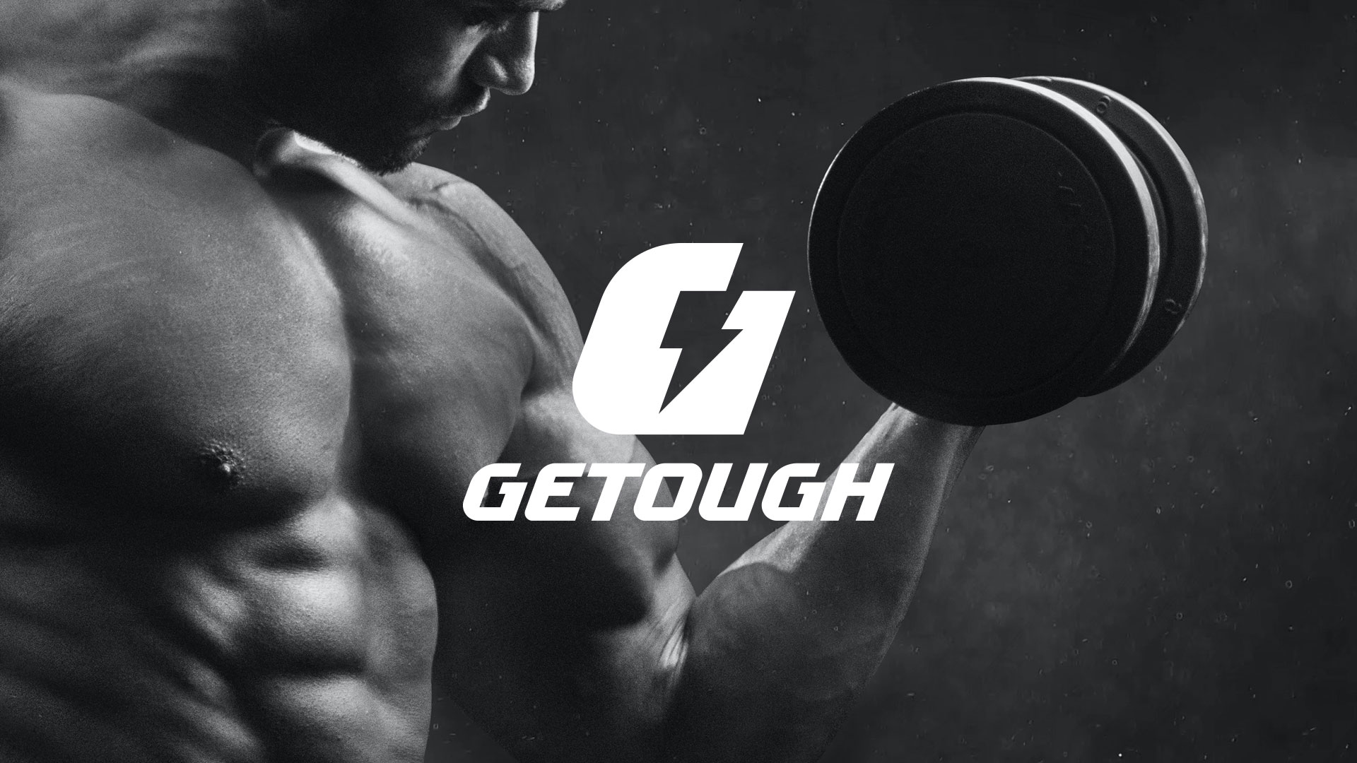
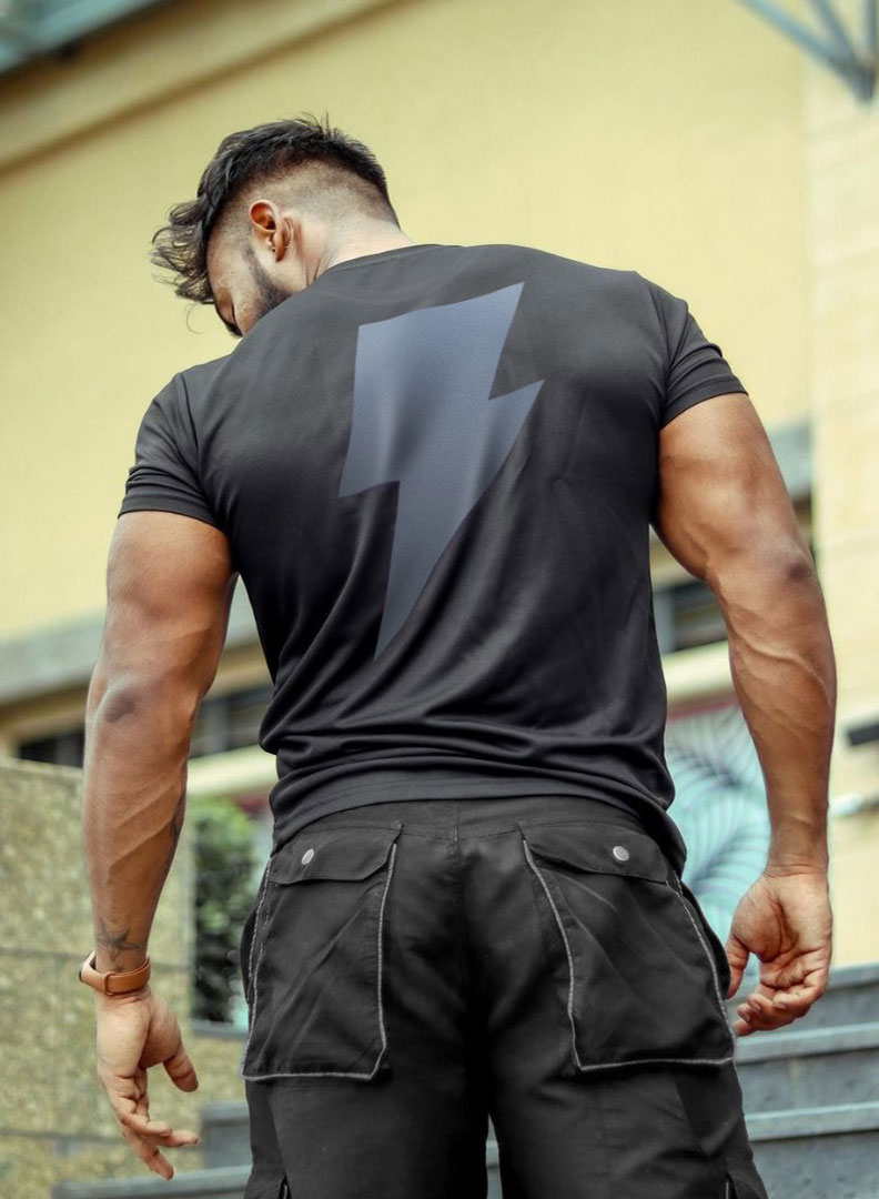
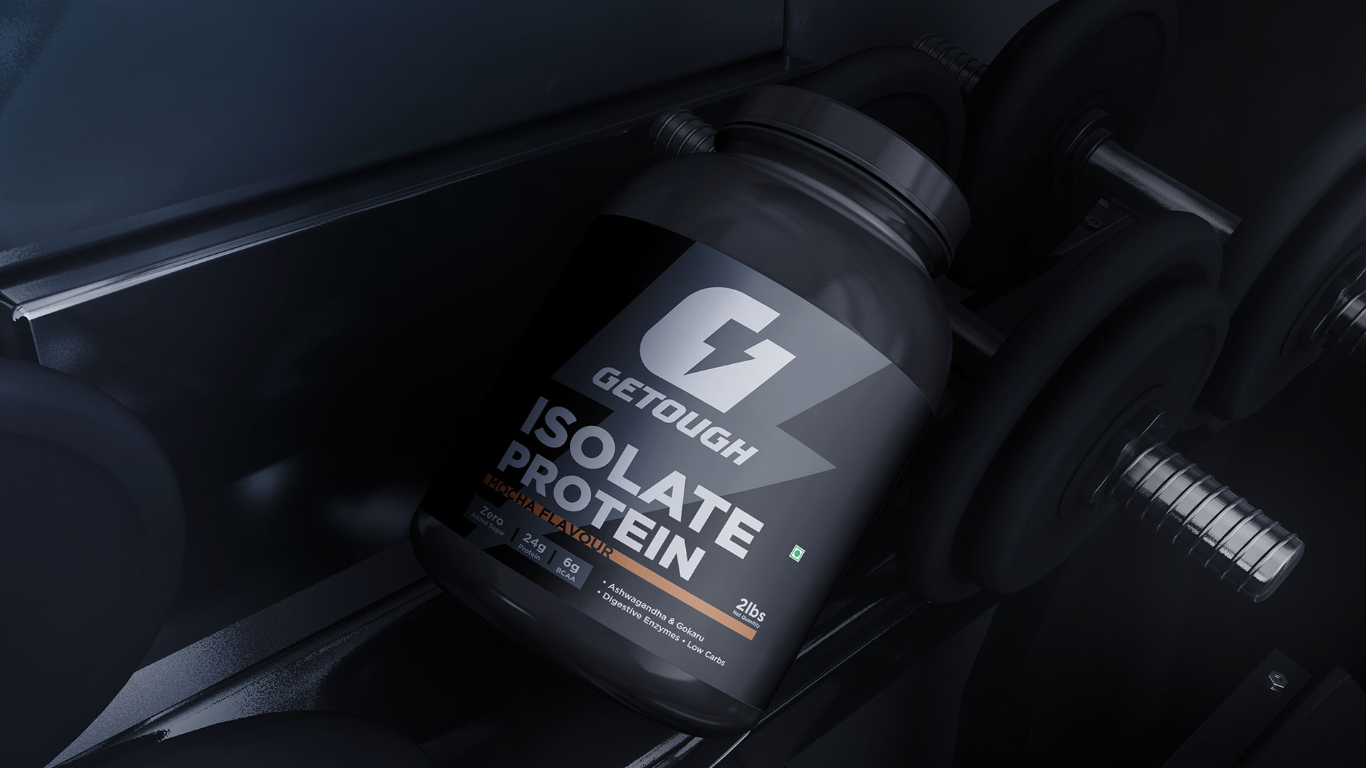
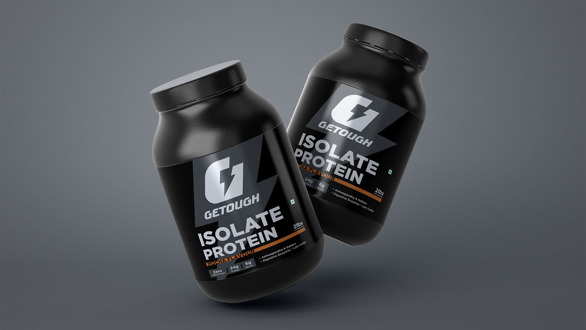
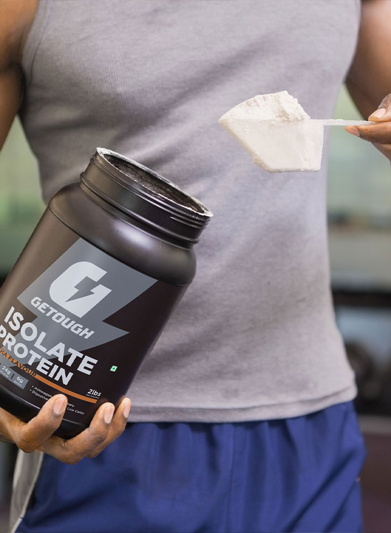
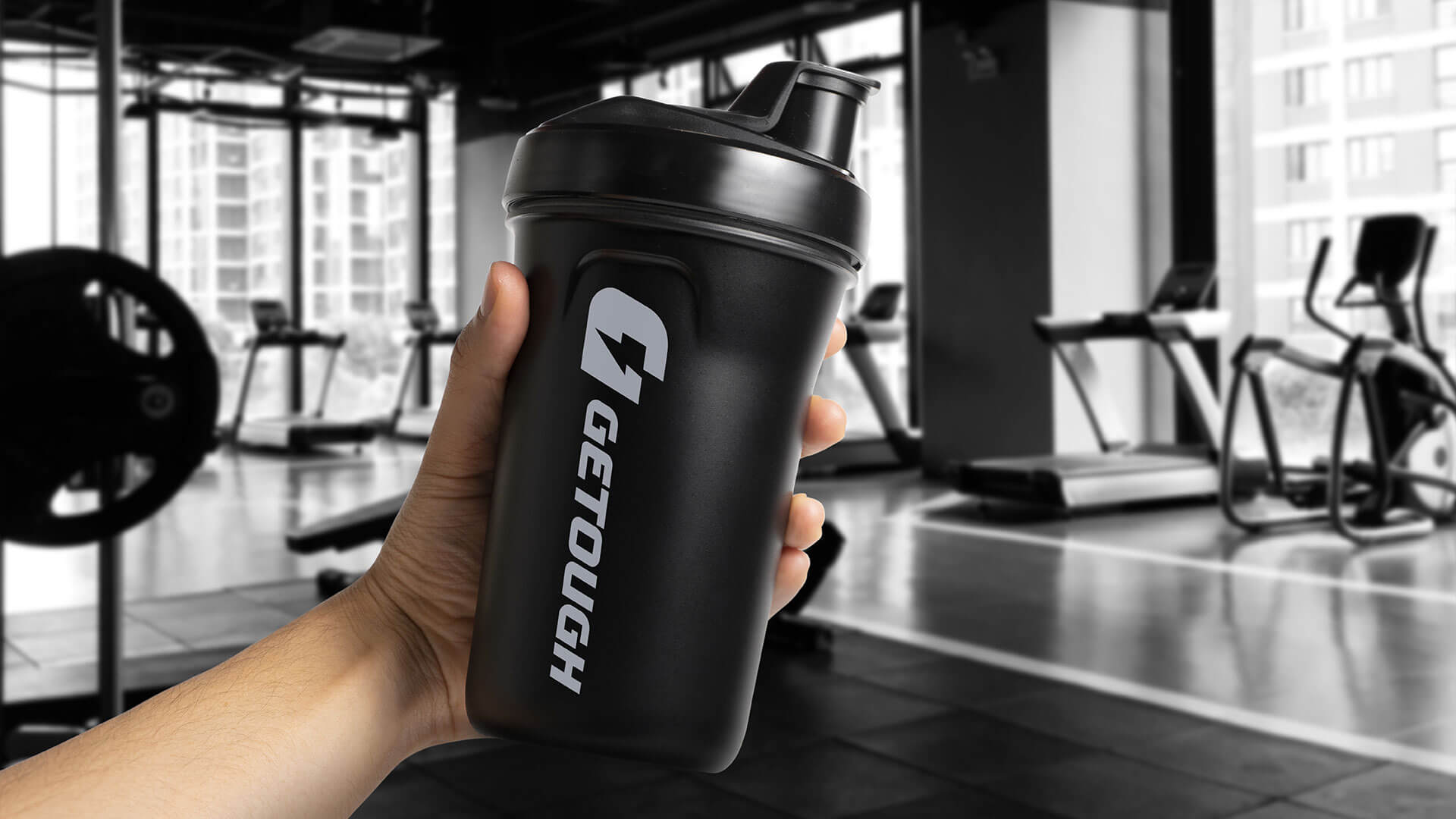
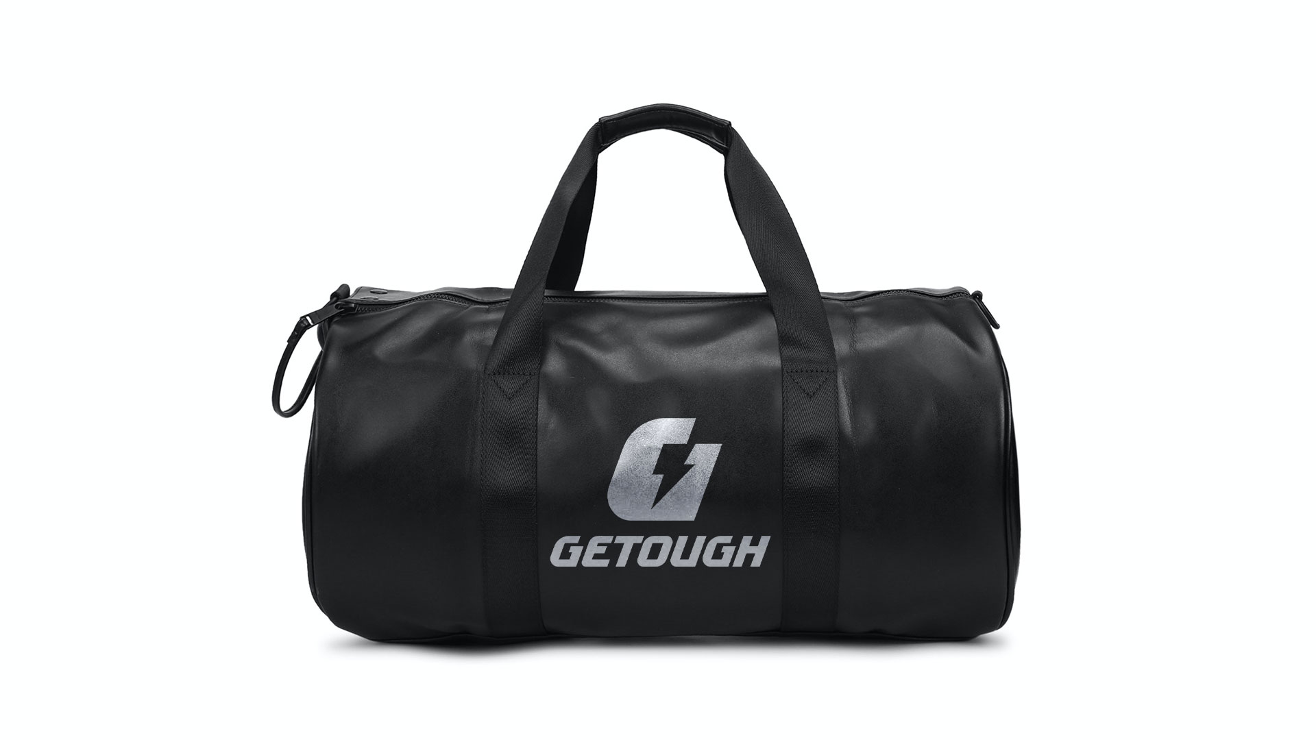
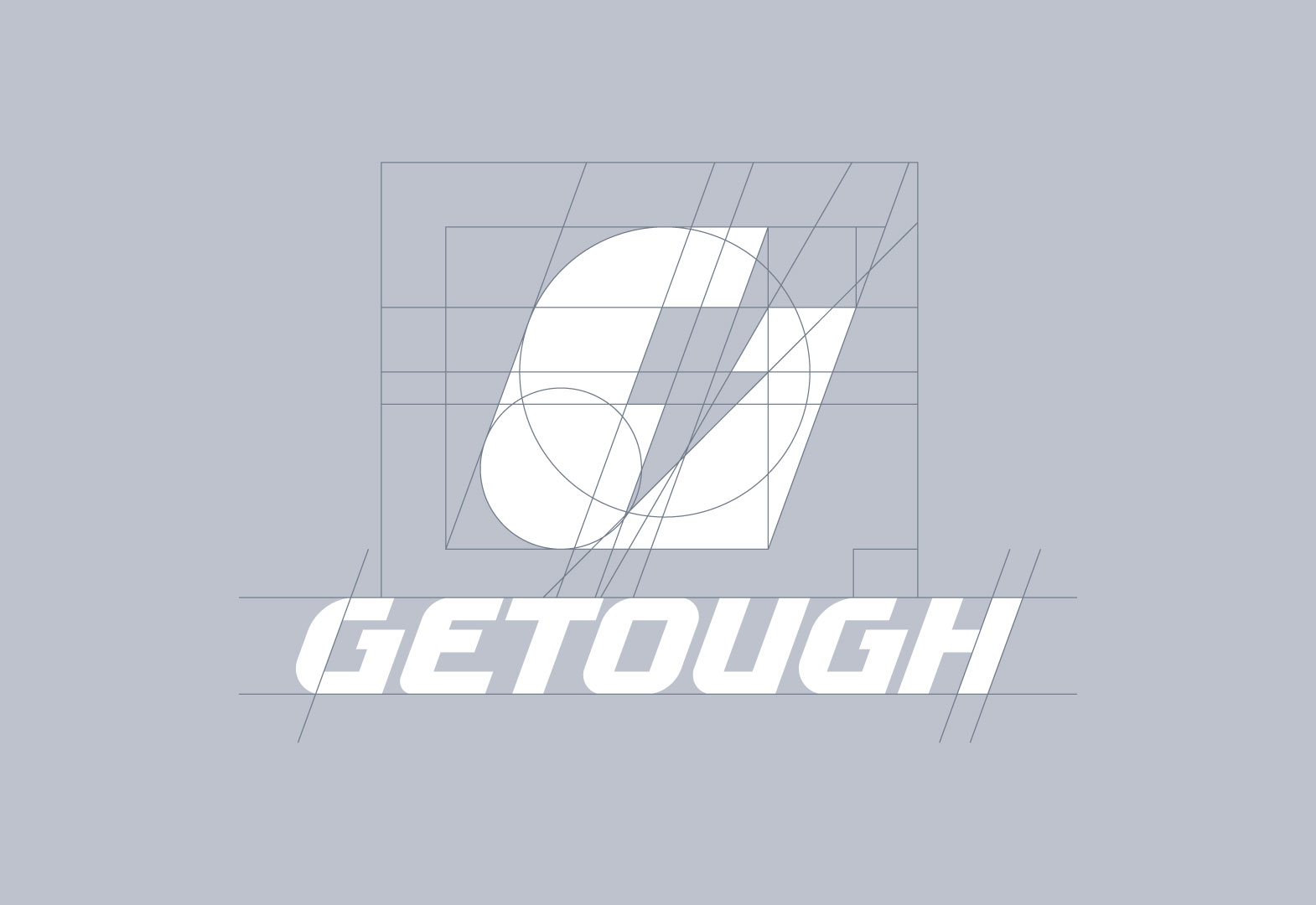
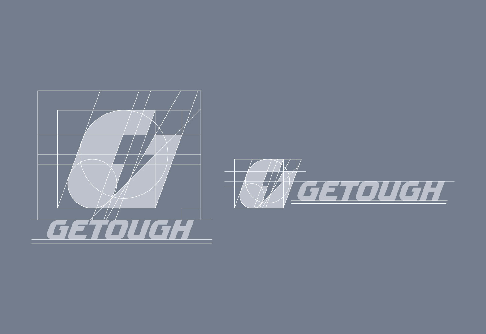
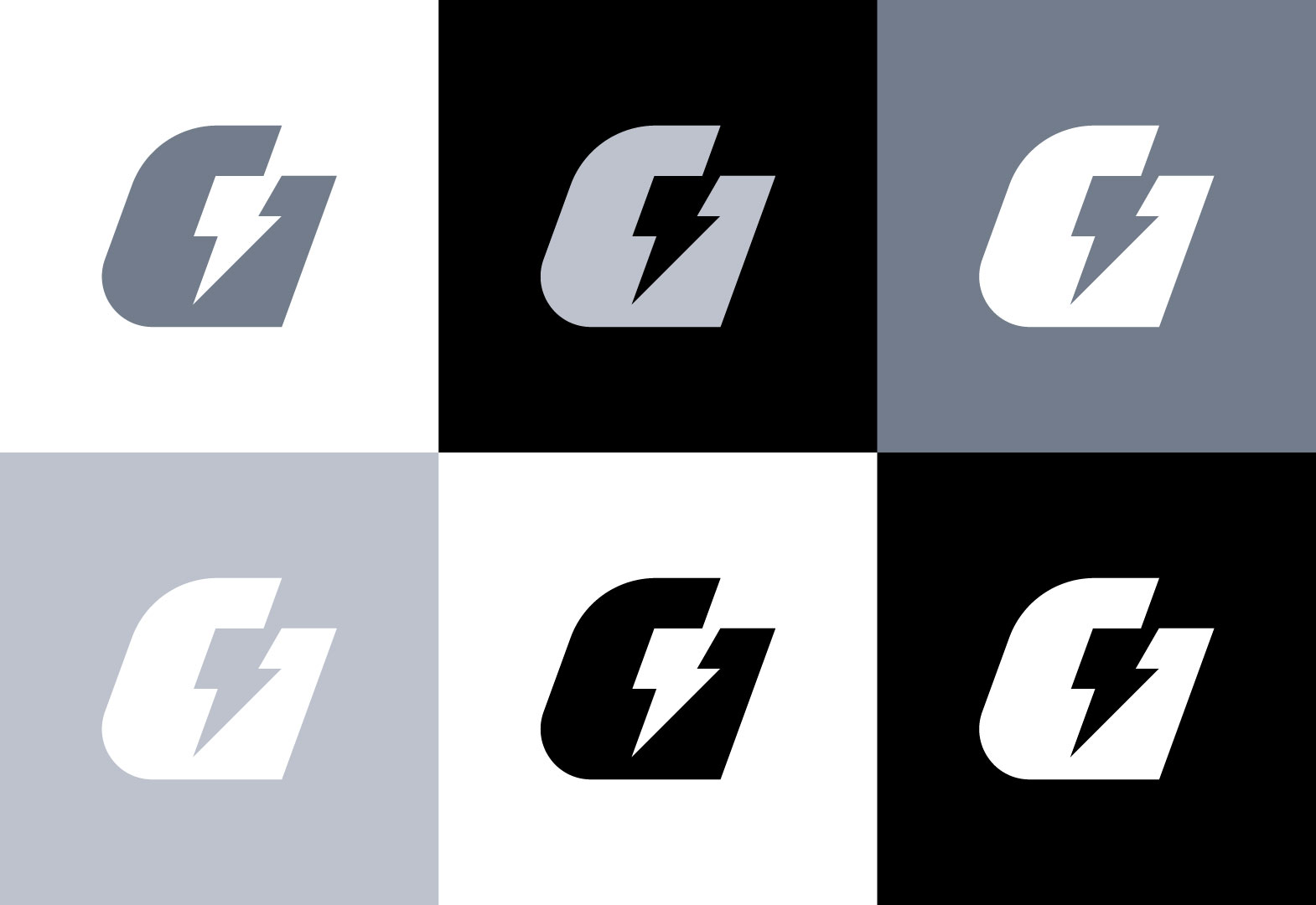
Designing a logo that captures the essence of GETOUGH was a crucial step in establishing the brand’s identity. The letter G has an energy icon inserted that takes the shape of bicep muscles. Inspired by the logo, a custom typeface was further created in bold black to accentuate the logo’s energizing and empowering feel.
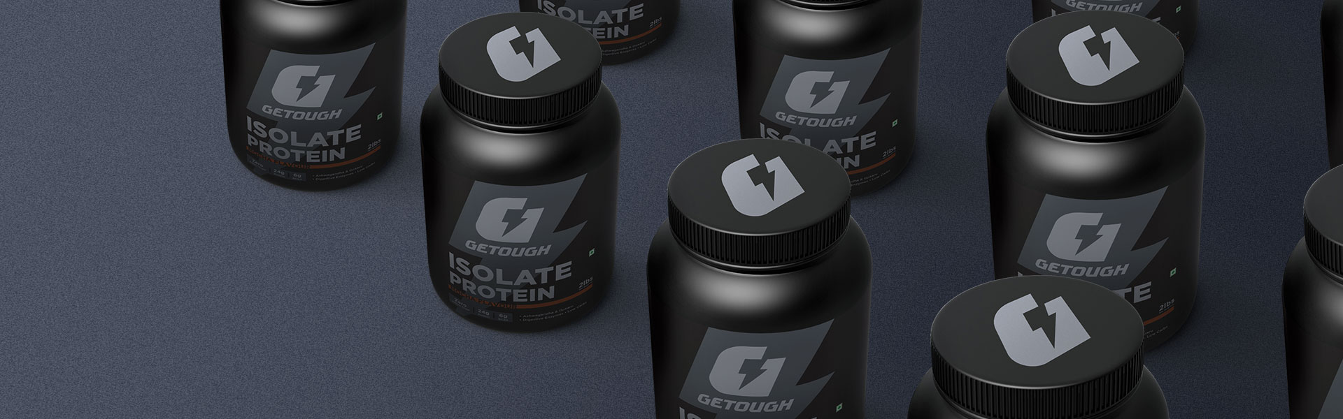
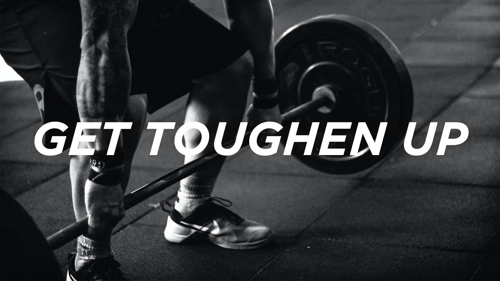
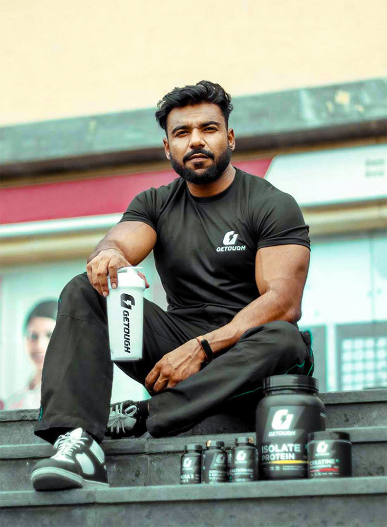
Their vision helped us come up with the tagline “Get Toughen Up”. Continuing the identity through packaging, we have kept the icon prominent to create a mark of a completely new brand in the market that helps customers instantly recognize GETOUGH. And the bold typography is appealing to take action for the first purchase.
Working with Getough was an exciting experience. The team at Getough had a clear vision for their brand, and it was our job to bring that vision to life through visual communication. We brainstormed ideas, explored different color palettes, and experimented with various patterns to create a brand identity that truly reflected the brand’s values. It was rewarding to see how our design helped GETOUGH stand out in a crowded market and establish itself as a trusted brand.