Crafting a Gentle & Comforting Identity for Ozemi
Area of Work
- Rebranding
- Packaging Design


When it comes to baby care, every detail matters. OZEMI, a brand dedicated to providing high-quality baby and adult diapers, approached us to redefine their identity and packaging. TI as their strategic and creative partner, infused OZEMI with a sense of comfort, softness, and gentleness, creating a brand that resonates with both parents and their little ones.
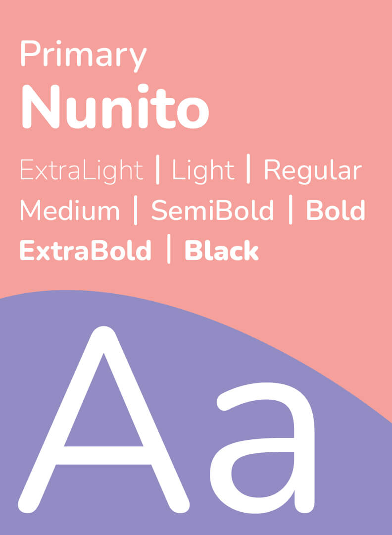
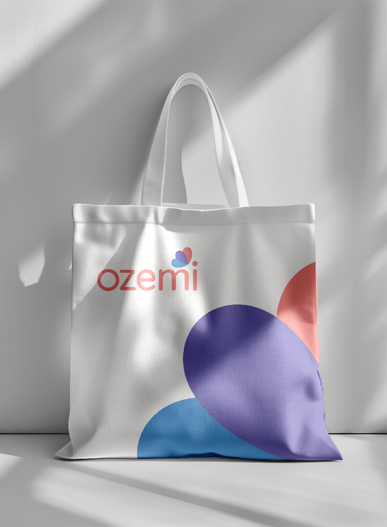
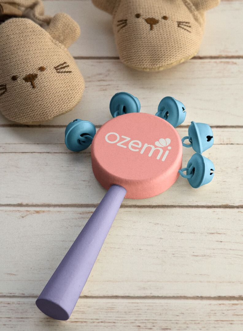
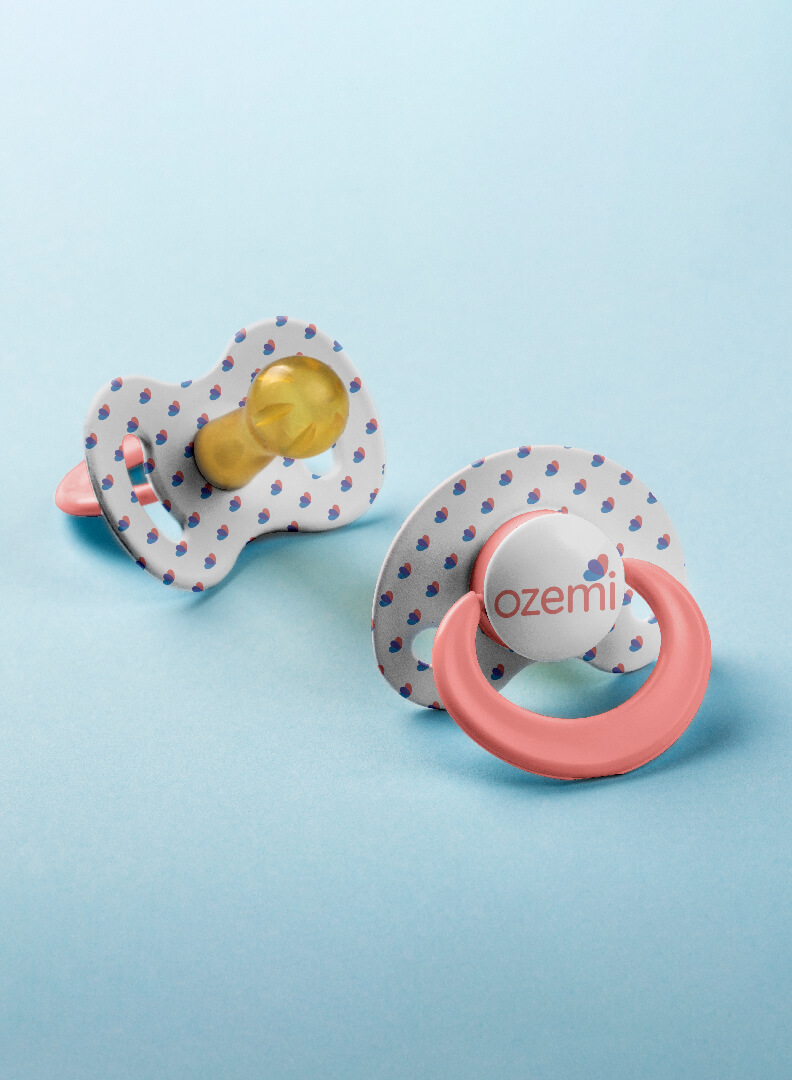
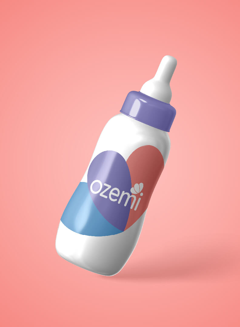
Our rebranding journey with OZEMI began with a clear vision: to convey the delicate care that OZEMI diapers offer. We crafted a logo that embodies softness and nurturing, using special fonts that exude warmth and tenderness. The pastel palette—featuring light blue, purple, and pink— was chosen for its soothing qualities. These colors create a calming and inviting visual experience, perfect for a brand dedicated to infants.
A unique element of the logo is the two intersecting hearts forming a butterfly, symbolizing love and care. This design is thoughtfully integrated, with the butterfly’s head cleverly incorporated into the letter “i” of OZEMI, highlighting the brand’s personal touch and attention to detail.
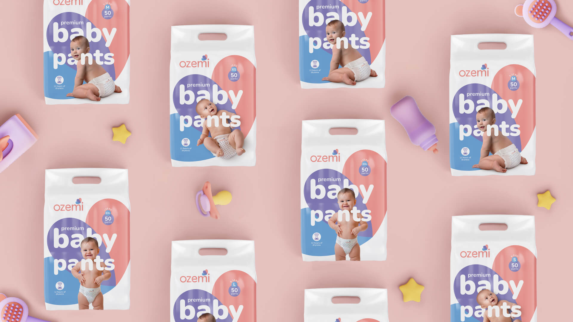
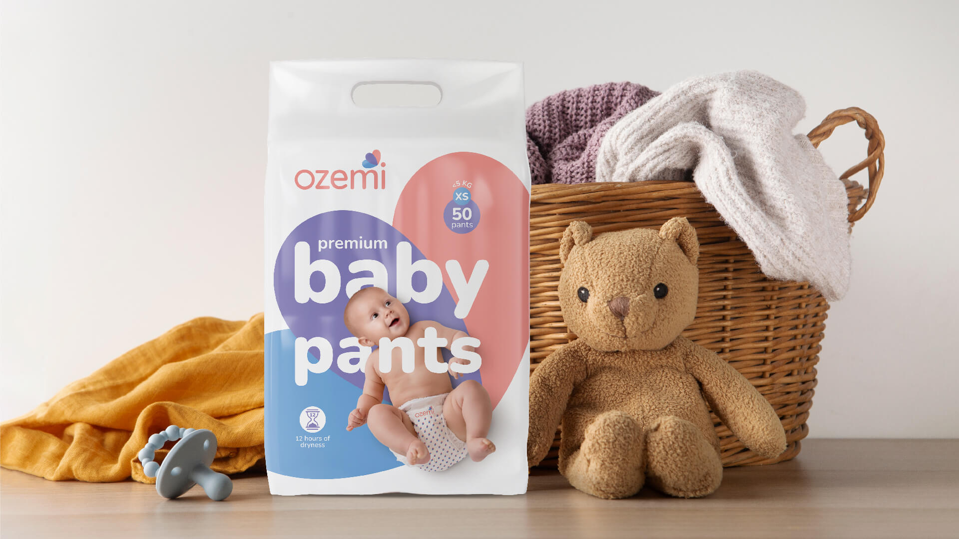
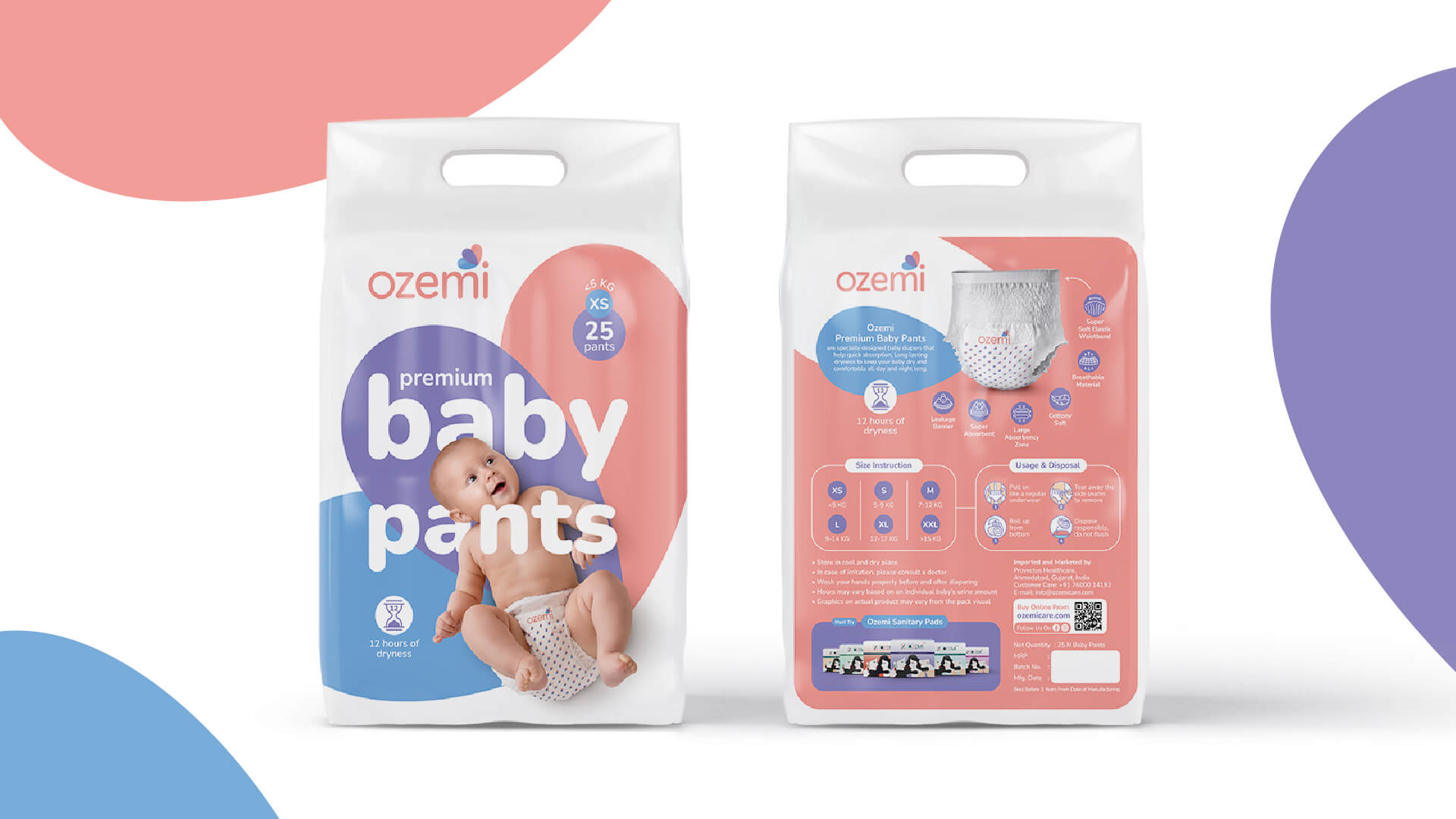
Continuing our vision, we translated the brand’s gentle essence into the packaging design for OZEMI’s six diaper sizes. These sizes are categorized into three distinct groups, each reflecting different stages of a baby’s development. The smallest sizes feature sleeping infants, symbolizing the newborn phase. As the sizes increase, the imagery progresses to sitting and crawling babies, and finally to walking toddlers. This thoughtful approach makes it easy for parents to identify the right product for their child’s growth stage.
The packaging design maintains the pastel color scheme and soft imagery, ensuring that it is not only functional but also appealing to both parents and children. By avoiding loud colors, we created a design that is gentle on the eyes, fostering a sense of calm and trust.
At TI, our vision for OZEMI was to create a brand that resonates deeply with parents, offering practicality and an emotional connection. Our comprehensive approach to rebranding and packaging design ensures that OZEMI stands out in the competitive market while maintaining its essence of care and quality.


Rebranding Showcasing Versatility
Exceptional is Synonyms of Unique


Creative Showcase on e-Commerce Platforms


Redesign with Calming and Gentleness at the Core

